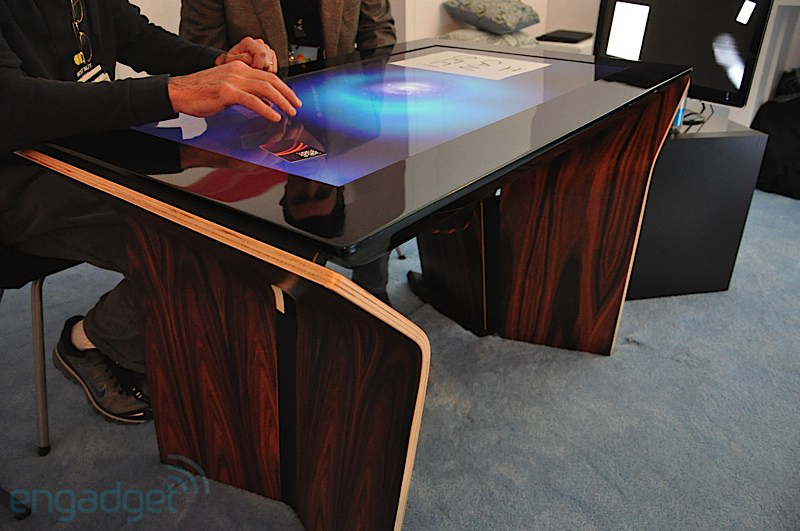
Surface 2 Design Work
I came to the Surface team to help them design and prototype new features for the upcoming version that would be a great improvement over the more experimental first version. The tabletop interface became a showpiece for Microsoft at the CES show in 2010, which I was able to attend.
The product later went on to become a popular series of tablets for the company and some of the ideas in the early tabletop versions live on today in the Surface Studio product.
Attract State
When users first walk up to a table they see an enticing looking array of visuals that resemble "digital water". I was responsible for assisting in the evolution of this aesthetic as well as create the animations around the Start button (the surface logo) which, when tapped, brought the table to life and displayed the user interface.
The particle animations swirling around the center logo were created algorithmically using ActionScript and then exported as various static looping animations.
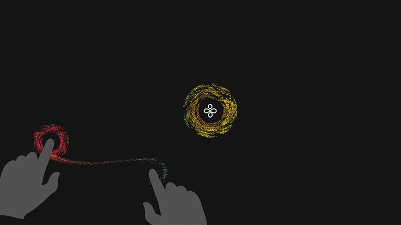
An example of an early exporation of particles and how users might interact.
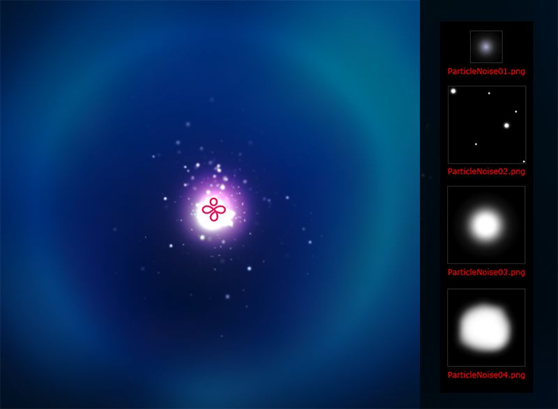
Attract state & start button particles.

Attract state in the wild, one of the more delightful elements of the Surface experience.
Object Box Demos
These demos were ideated and created to show the potential of Surface's new object recognition system. The dial control was later implemented into the the present day Surface Studio product.
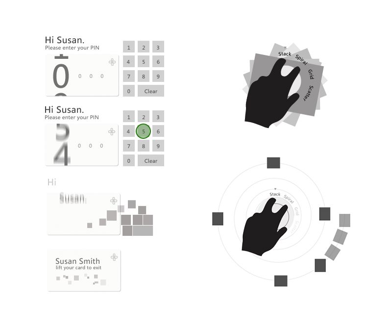
Early IxD explorations of Transparent Cards (left) and Dial (right). The dial idea later went on to be productized in the Surface Studio product.
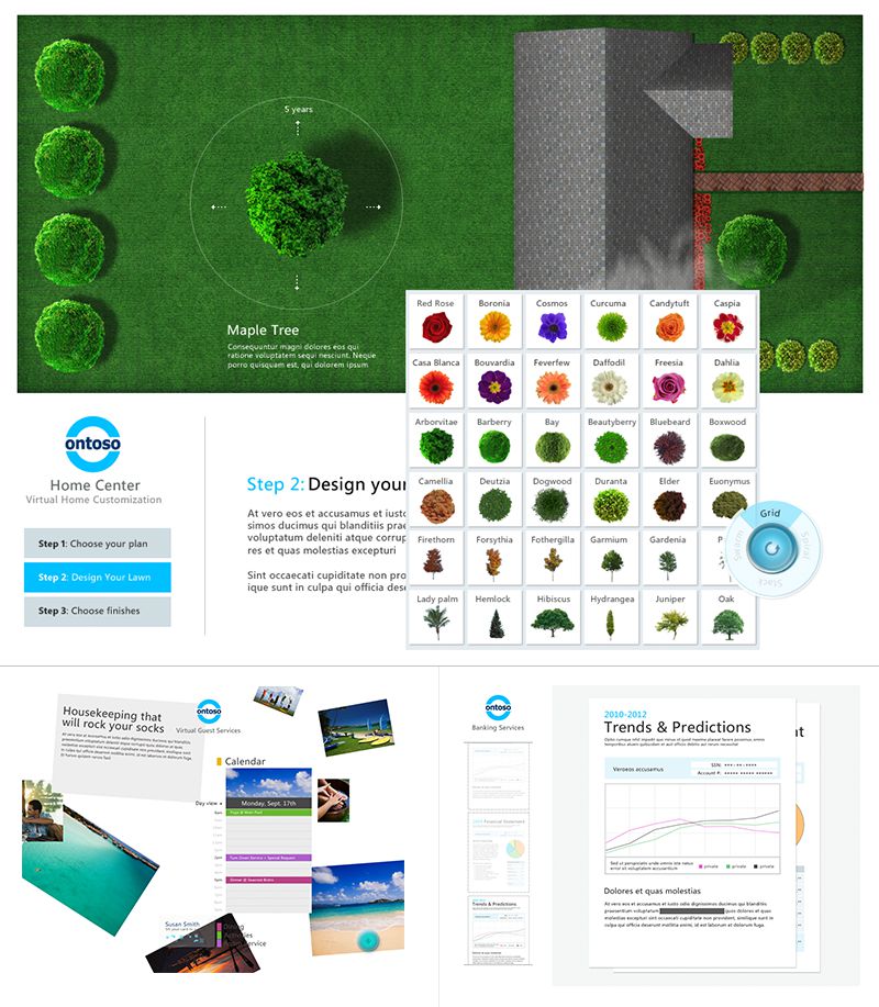
Three of the demo designs that show off the object capabilities.
Keyboard
I was responsible for redesining the keyboard from the original Surface and bringing it up to date with the new Metro design language and updated tech specs.
To aid in the design process, I created a working prototype that user researchers could use to make real-time tweaks to button sizes and other variables. This helped us hone the design for the most natural feeling experience.
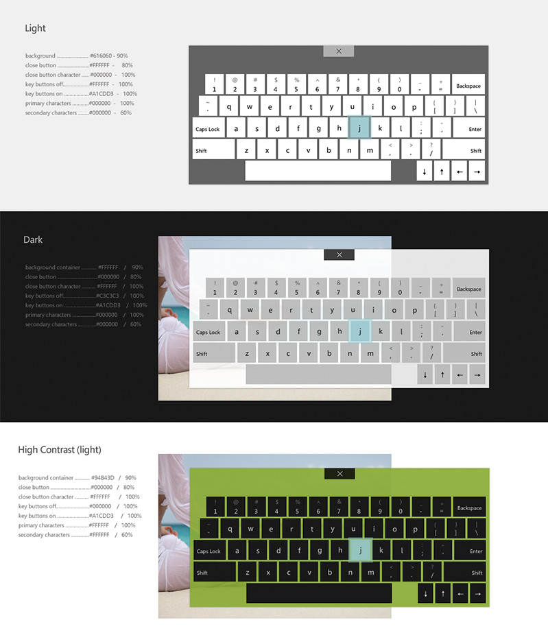
Various color schemes.
Launcher Icons
While working with the principle designer on the launcher design IxD, I also designed all of the default app icons. They were created in a simple iconic, flat style that was in the spirit of the Metro design language.
Config Tool
The configuration tool helped operators of the table setup and configure the device easily.
After the design was completed, the multi-page app was redlined and specced for developers to implement.
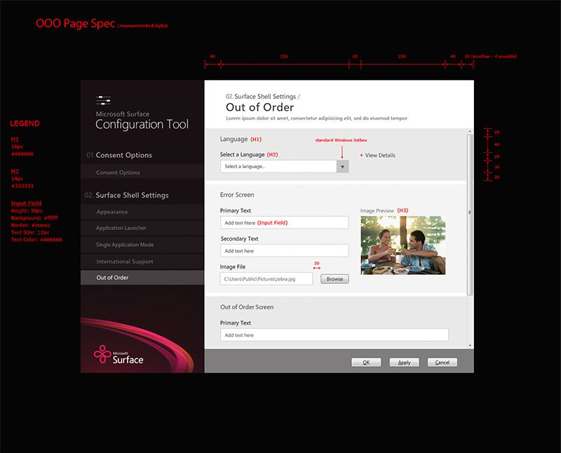
Simulator
The simulator tool was used to simulate the Surface gestural and interaction system on non touch-enabled devices for testing purposes. I designed the screens, interactions and touch icon necessary for developers.
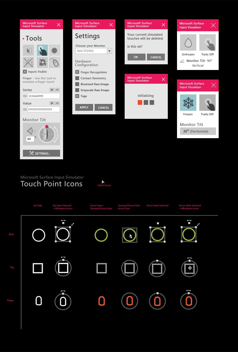
User Interface & input icons/specs.
Marking Menus
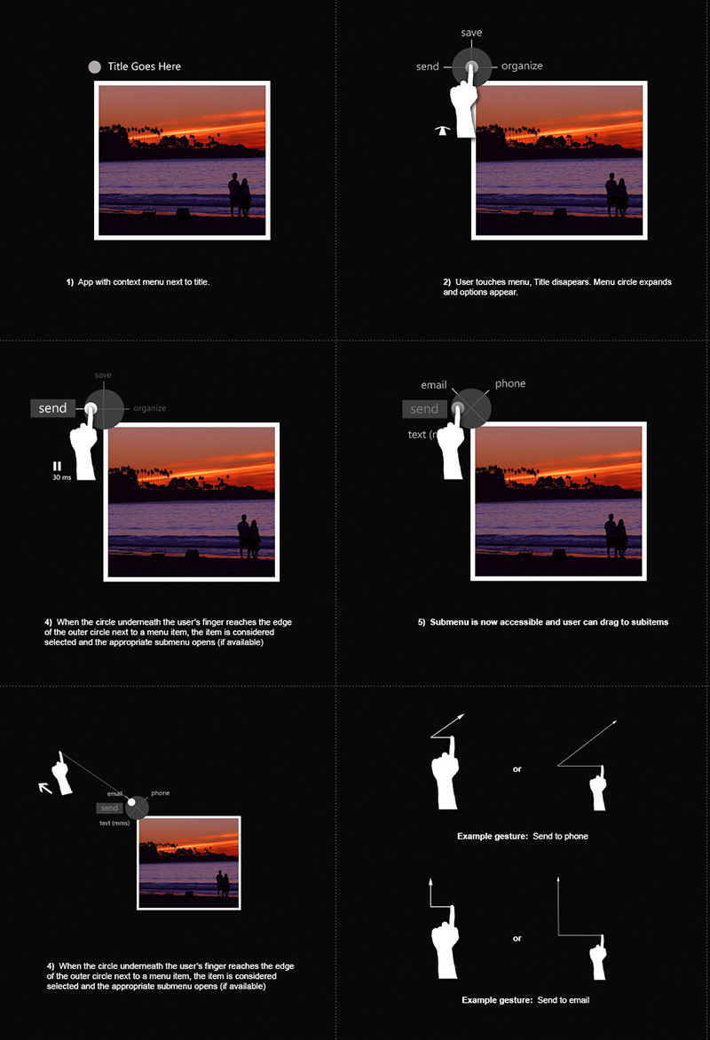
One of the first projects I worked on while on the Surface Team was to explore menu options for items. These were some of the marking menu explorations based on the research I did. I also created functional Flash/Actionscript prototypes for how the menus would function.
User Interface & input icons/specs.