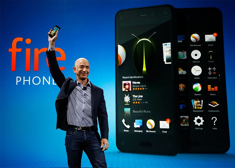
Amazon Fire Phone OS
The Fire Phone UX team began with a small team of talented designers (I was #4), and eventually grew to over 30, many of them highly specialized designers and artists.
This made the project feel like a fast-moving, constantly pivoting startup.
In the early-days, I spent a lot of time experimenting with blue-sky ideas, experimental interaction models and visual design language in a highly collaborative environment.
Early Product Ideation
Eye-tracking, Augmented Reality and other novel technologies were things I explored early in my tenure at Amazon. How could we use these new technologies to create interesting and useful user experiences?

Early Product Interaction Design
A sophisticated 3D camera system was one of the mandates for the new phone project, and we spent a lot of time thinking and dreaming how to best use this technology.
Through collaborative white boarding sessions, and using tools like SketchUp and Cinema 3D, I helped to explore UIs in volumetric 3D space.

Visual Exploration
I was the first designer on the project tasked with beginning the visual exploration process.
Through moodboarding and vignetting (small visual studies that helped explore visual style while maintaning neutral to interface requirements) the early visual style of the the OS took root.

User Interface Design
Taking elements from the moodboard and vignette process, rough user interface ideas emerged.

Amazon Maps
Later in my tenure at Amazon, I moved teams to focus on the newly established Map app. I was responsible for the visual UI work and crafting the aesthetic experience for the app, while contributing to the core IxD as well.
Moodboards
As in the core OS, I created moodboards to help the team explore and discuss the visual style of the cartography and 3D models that were to be created for the many landmarks scattered across the maps.

User Interface
I was responsible for the visual screen design and production. I worked collaboratively with the IxD designer, Cartographer, 3D designers, Core OS team, and engineers to produce all the screens necessary for the app.

Animation
I was responsible for efforts to explore how certain UI elements could animate. In doing so, I directed a small team of 3D animators to help envision how turn-by-turn navigation might function in a 3D world.
Pins
Many different graphic elements were designed and produced for the maps app. Pins were one I explored in depth.
